
How might we identify gaps, improve usability for all voters including those with accessibility needs, and increase the long-term value of the app so it supports users before, during, and even after the election?

Elections Ontario’s voter app struggled to gain adoption due to its limited functionality and reliance on website content.
Downloads dropped 40% from 70K in 2022 to 42K in 2025, highlighting a clear decline in value to voters.

Project Overview
Problem

Solution
To stay relevant, the app needed to be reimagined with year-round utility, accessibility, and modern design standards.
I mapped user flows to uncover gaps, researched other electoral bodies, interviewed stakeholders, and conducted market analysis to inform design decisions.

Impact
The redesign and research work provided a clear understanding of voter needs feeding into a larger discovery project.
It also helped Elections Ontario prioritize features and allocate resources for focus groups and usability testing.

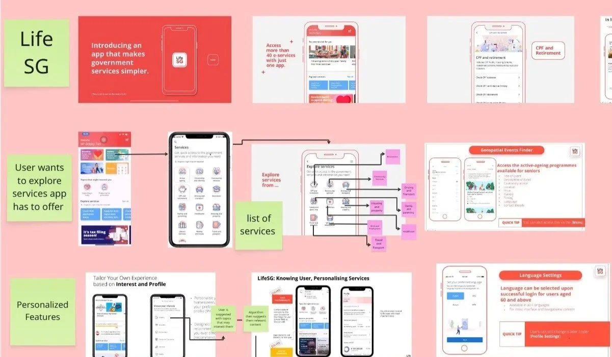
Conducting a Comparative Analysis of Other Electoral Apps

Next, I led a competitive analysis to better understand the landscape. I first pinpointed common features shared across election apps, then highlighted each platform’s unique value proposition. I explored voter focused platforms, civic engagement tools, and voting apps both nationally and globally. I gathered data from a wide range of sources, focusing on app features, user-friendliness, trends, and how relevant the experience was beyond the election period.
Outputs:
Identified baseline features voters expect across platforms, creating a benchmark for the app.
Surfaced unique differentiators and best practices from civic tools used nationally and globally.
Revealed opportunities to expand the app’s relevance beyond election day, drawing on global examples of year-round engagement.
These insights directly informed our project approach, specifically guiding how we structured our app’s budget and identified the types of user testing we needed to prioritize.
Tools Used: Miro
Exploring Design Strategies to Improve Clarity
Key Takeaways
Gathering Contextual Research
To start off, I explored broader context-setting work. I looked into why certain age groups are less likely to vote, how privacy laws might impact our design decisions, and what legal or ethical considerations we needed to keep in mind, especially around the use of AI.
Outputs:
Explored public perceptions of trust in digital platforms.
Understood the boundaries of what the app could do, what risks we needed to be aware of, and where we had room to build something more meaningful and responsible.
I gathered data from a wide range of sources, focusing on app features, user-friendliness, and how relevant the experience was beyond the election period. To support this work, I also created a stakeholder map to better understand the broader ecosystem we were designing within.
Tools Used: Miro
The Design Process
The Challenge:
Every year, millions of voters navigate the complexities of an election, yet many struggle to find the information they need, when they need it.
The Elections Ontario (EO) app was meant to simplify this process, providing access to critical election-day information, especially the Voter Information Card (VIC).
Despite being a native app, much of the experience felt like detour back to the website, leaving users with a fragmented journey. For a process as important as voting, this created a gap between the service and the people it was meant to serve.

The Opportunity:
The app had the potential to modernize the voter experience, yet limited functionality and engagement meant it was not living up to that promise.

Building on the insights from research, user flow mapping, and competitive analysis, I began developing wireframes and low-fidelity prototypes that addressed the key pain points identified.
I focused on simplifying navigation, reducing unnecessary redirects, and proposing features like real time tracking, civic modules, and in-app surveys. Each proposal was informed by evidence, drawing on user behaviour, unmet needs, and best practices from other civic and engagement apps.
Outputs:
Annotated wireframes
Low-fidelity prototypes
Feature proposals
Tools used: Figma, Miro
Mapping out which privacy impact assessments are relevant to our research findings.

Synthesizing on current levels of citizen trust in the context of voting.


Journey Mapping User Flows
Next, I mapped out user flows. This helped surface user pain points, where content was buried or duplicated, and where the app’s logic didn’t align with the intended journey electors wish to take when navigating the app. This visual framework became a critical starting point for forming hypotheses and identifying pain points.
I also reviewed metrics from our research and insights survey that showed a decline in elector downloads compared to previous elections. That led me to ask: What are people actually using this app for? Are we delivering on that need clearly and quickly?
The survey data suggested most users download the app to access their Voter Information Card (VIC), but once they’ve done that, the app loses relevance. This raised a broader question: How might we increase the long-term value of the app so it supports users before, during, and even after the election?
Outputs:
Generated design concepts to simplify the app and minimize redirects.
Assessed whether the app truly met a users most basic needs (access to VIC, registration, changing voter address)
Tools Used: Miro

By analyzing other voting apps, I translated proven strategies into actionable insights that could modernize and strengthen Ontario’s approach.

In this picture I map out the flow an elector will take via the app in different scenarios; If the user has already registered/ if they are accessing our app as a guest/ If they wish to sign up.

User flows mapped via a red line indicate that information is rerouting to the website. Those mapped via a green line show where information is being duplicated.

I evaluated service lists and personalization features across government apps to uncover strategies that could enhance the voter experience.
By mapping out the flows and features of other elections apps’, I was able to identify best practices and translate them into opportunities for design improvements.


This prototype reimagined the EO App with a personalized dashboard, tailored to each voter’s key election needs and information.
This project highlighted how critical it is to design with the user’s entire journey in mind, and not just isolated touchpoints. Through mapping user flows, conducting in-depth research, and benchmarking against competitors, I uncovered where the app created friction, buried essential information, and relied on confusing redirects, and equally, where it had the potential to provide meaningful, ongoing value beyond the election period.
If I had more time I would:
Conduct longitudinal testing to observe how users interact with new features across multiple elections and explore opportunities to embed year-round civic engagement.
Ultimately, this project reinforced the importance of translating broad research into clear, actionable opportunities for service improvement, while showing how comparative analysis and stakeholder insights can reveal hidden gaps.
Proposals Included: Real-time Candidate Tracking, In-App Surveys, Personalized User Dashboard, AI Search Model, and Civic Engagement Modules.